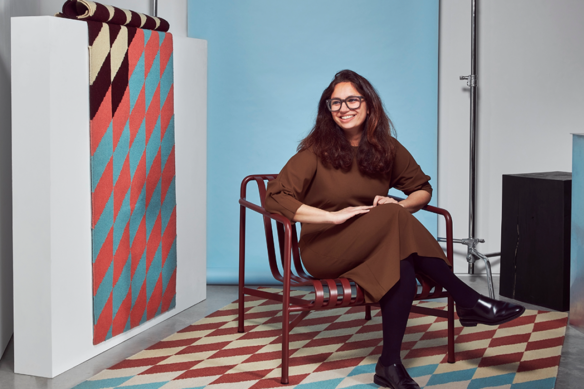
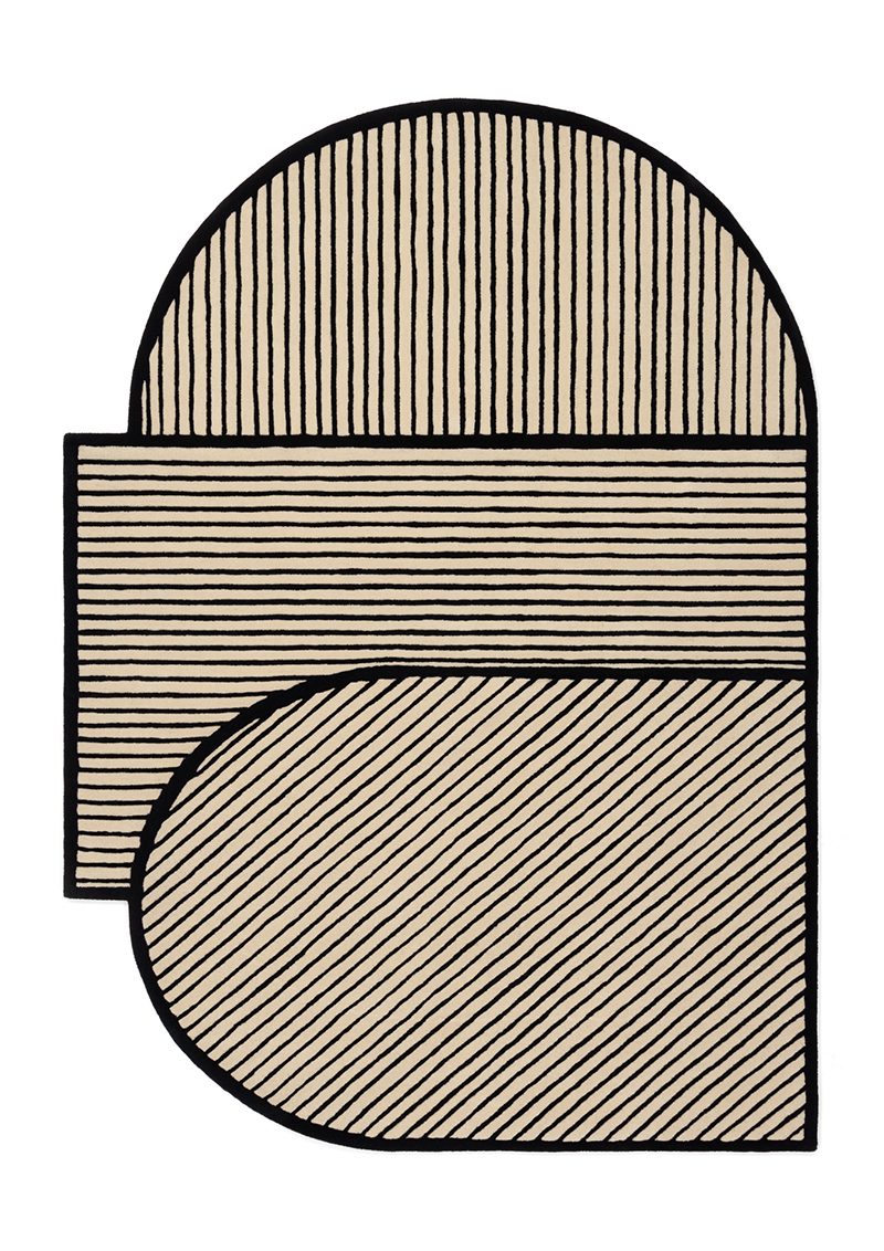
Colour is an integral part of Kangan’s design process, this being a very tactile process of research and discovery. A Dictionary of Colour Combinations by artist and designer Sanzo Wada guided Kangan throughout a trip to Japan which she later used to curate the palettes seen in our rug collaboration.
We talk to Kangan about her approach to materiality and colour:
What strikes you most about Sanzo Wada’s Dictionary?
‘The dictionary is how I experienced colour when travelling in Japan - it was put together in the 1930’s but I was finding the same colours in today’s urban environment as I went around. The post office for example, was painted in the exact same palette that I discovered in the book - 90 years on. I was there running a design workshop and subsequently made some work inspired by old Chirimen fabric archives. What struck me was the links I found between India and Japan, from their fascination of Madras checks in the Edo period to their patronage of Indian village textiles today.
How do you approach balancing colour palettes?
I am always building my library of colour - through photography, drawing and collecting objects. Colour is also a very physical material to me, it’s not something I can digitally apply at the end of the design process. It’s often the starting point. We need to stay in touch with our material cultures, to see and touch - as designers and as human beings - digital materials and techniques although practical, lose a lot of the magic!
What exhibition has most inspired you in adult life?
Bridget Riley at the Hayward, because I was slightly in shock at what it did to my senses. I had to sit down every five minutes as the works were moving in front of my eyes! How she applies colour has had a huge impact on me as a designer, as I’m always thinking about what I can make colour do, not what it can do for me