Styling Plum Noir and Jade
A Bold Interior Design Guide
Thinking about designing a room with deep, rich colours? It can feel pretty intimidating, right? Many of us stick to safe neutrals because mixing vibrant hues requires a careful balancing act. But if you want a space that feels both luxurious and inviting, pairing jewel tones is absolutely the way to go.
Plum noir and jade make a stunning contrast. The warmth of deep purple-red balances perfectly against the cool, earthy tones of green. When you mix these colours right, you'll create an atmosphere that feels intentional, sophisticated, and totally you.
This quick guide breaks down exactly how to pull off this bold colour combination. We'll explore how to anchor your room, balance your colour palette, and layer textures to create a beautifully finished space. Here's your blueprint for interior styling success.

Mint Plot mood board
Centering the Room: The Power of a Foundation
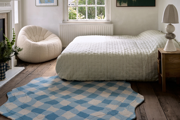
Every well-designed room needs an anchor. Before you paint the walls or buy a sofa, you've got to establish a focal point that ties everything together. A high-quality, handmade rug acts as the perfect foundational piece. It defines your room's zones, absorbs sound, and sets the design direction.
For a plum and jade scheme, the Mint Plot Rug by FLOOR_STORY serves as an amazing starting point. Its geometric patterns and contemporary hues provide a roadmap for the rest of your design choices.
Quick Tips for Anchoring Your Space:
- Start from the ground up: Choose your rug before you finalise your paint colours. It's way easier to match paint to a textile than to find a rug that perfectly matches a painted wall.
- Invest in handmade quality: Hand-knotted or hand-tufted rugs, like the Mint Plot Rug designed by Gill Thorpe , offer better durability and richer color depth compared to machine-made alternatives.
- Size matters: Make sure your rug is large enough so that at least the front legs of your main furniture pieces rest on it. This simple trick makes the room feel much larger and more pulled together.
- Pull colours from the weave: Use the subtle tones you find within your foundation piece to guide your accent pillows, artwork, and window treatments.

Mint Plot rug in bright concrete space.
Mastering the Plum Noir and Jade Colour Palette
Plum and jade are pretty strong colours. If they're competing for attention, your room can quickly feel overwhelming. The secret lies in careful proportion and thoughtful contrast. You'll need a neutral backdrop to let the jewel tones shine, plus a bright accent colour to inject energy into the space.
Quick Tips for Colour Palette Integration:
- Create a muted backdrop: You need a soft, grounding colour on the walls to prevent visual fatigue. Try a muted shade like "Gwen" by Coat Paint. This soft, earthy neutral provides a warm canvas that lets plum and jade stand out without clashing.
- Balance warm and cool tones: Let jade dominate the larger furniture pieces for a calming effect, and use rich plum for secondary items like accent chairs or heavy drapery.
- Add a high-contrast accent: Bring in a third, unexpected colour to make the room pop. A zesty yellow creates a brilliant contrast against both the dark plum and the vibrant jade.
- Use yellow strategically: Apply this zesty yellow in small, impactful doses. Think of a single upholstered ottoman, a bright ceramic lamp base, or a vibrant throw blanket draped over a plum chair.

The Duke by Trifle*
Layering Textures for Depth and Interest
A room built just on colour will look flat. To make your space feel truly inviting, you've got to engage the sense of touch. Textural layering is mixing different materials, rough, smooth, matte, and shiny to create depth. When you're working with rich colors like plum and jade, texture prevents the room from feeling heavy or one-dimensional.
Quick Tips for Incorporating Diverse Textures:
- Mix contrasting upholstery: Don't match your fabrics. Instead, pair different weaves to build a tactile experience. For example, use the richly patterned "Atlas Selago" by Studio Ashby for your statement seating. Contrast this with the deeply textured, tactile "Raas" fabric by Kvadrat on your sofa or accent cushions.
- Include hard, smooth surfaces: Contrast the soft upholstery and plush rug with sleek, hard materials. Use "Durat Palace Terrazzo" for side tables, countertops, or even statement flooring. The smooth, speckled finish of the terrazzo reflects light and breaks up the heavy fabric elements.
- Balance matte and sheen: If your upholstery features matte finishes, add elements with a slight shine. Brass cabinet hardware, glass vases, or glossy ceramic tiles can reflect natural light and keep the jewel tones feeling lively.
- Add natural elements: Wood tones help bridge the gap between bold colours and varied textures. A walnut coffee table or oak shelving unit will introduce organic warmth that ties everything together beautifully.

Gill Thorpe
Mint Plot Runner
Gill Thorpe
Anthurium Bud Runner
Gill Thorpe
Echinacea Plot
Gill Thorpe
Echinacea Plot Runner
Gill Thorpe
Herringbone in Red and Blue
Gill Thorpe
Lattice in Blue Tonal
Gill Thorpe
Trellis in Burgundy and Lilac
Gill Thorpe
Chevron in Cream and Burgundy
Henry Holland
I Feel Love in Berry Red
Carmellia Indrawati
Marmalade in Mint
Emily Forgot
Amedee in Pink Multi
Emily Forgot
Amity in Pink Multi
Emily Forgot
Aldo Pink Multi

Design From Scratch
Sometimes the simplest idea is all you need to go bespoke, this case study is a great example how you can use a two colour gradient to enhance an interior scheme.

We’re a B Corp!
We’ve been busy ensuring that our best practices are up to scratch, becoming a B Corp has proven our commitment to a business structure that works for everyone.